This summer Sabeth Vela from watson contacted me to make a video reportage about Personal Colour Analysis. What a joy!
Read MoreApproximately four years and three and a half months have passed since Style Identity has welcomed its first client. My client-related statistics bring me joy and order and I absolutely love keeping track of them. Thus, let me share them with you. Let’s start broadly. What is the most frequent Season: Spring, Summer, Autumn or Winter?
Read MoreInterior design in the colour palettes of Summer Seasons: Light Summer, Cool / True Summer and Soft Summer.
Read MoreThree years (more precisely three years and one month) have passed since I’ve received my first client. I want to thank everyone who has supported Style Identity over the past 3 years. Because I love statistics and because I have shared them before (year one, year two), let’s have a look at a couple of pie charts ;-).
Read MoreEvery colour and material in the relative proximity of our face is relevant. It makes sense to dress our homes to flatter our complexion the way we dress our bodies.
Read MoreThis is what I call beauty, this is what I call harmony. A green-eyed Soft Summer wearing her best shade of green. An effortless elegance. What more would you wish for?
Read MoreLet’s have a look at the statistics from the last 24 months. What Colour Type was the most frequent?
Read MoreAre we moving towards an era where accent colours will become the myth of the past? Did it all start with Kim and Kanye?
Read MoreEvery Colour Type has its own “version” of blue.
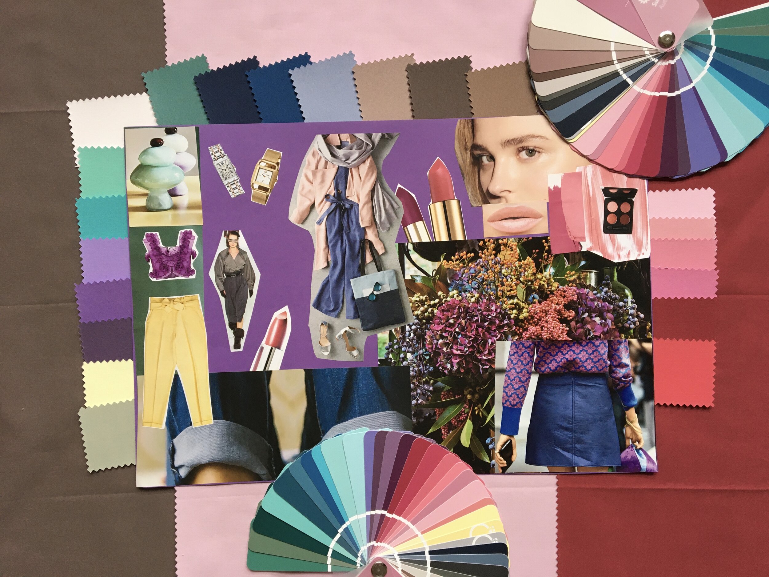
Read MoreThis is the second mood board dedicated to the Soft Summer Colour Type.
Read MoreThe moment we realise that clothes are communication, getting dressed becomes a strategic game.
Read MoreNot every Bright/Clear Winter has a textbook bright blue eyes!
Read MoreE. was one of my very first clients. When I saw her, I though that she could be a Soft Summer or a Cool/True Summer. However, she turned out to be a Light Summer.
Read MoreGreen is difficult. Get it wrong and the penalty is rather high. Get it right and you stand out.
Read MoreEach personal colour palette contains colours the general public thinks of as “safe” colours (such as navy, grey or a shade of white) as well as colours that are often considered “wild” or “risky” or “unflattering”.
Read MoreThe video tutorial features Jessica Alba creating a warm and bronzy makeup look using neutral colours from the Autumn Seasons’ colour palettes.
Read MoreI bet you have some grey items in your wardrobe too! Grey is easily accessible in stores and many people assume that they can do no wrong if they choose to wear grey. Well, as usual, this article will show the differences between greys for the 12 Colour Types.
Read MoreDid you know that purple dye used to be so expensive that only royalty could afford it?
Read MoreThe “Colours To Avoid” series continues. We have looked at the worst colours for Light Spring, Warm/True Autumn and Bright/Clear Winter. Let’s have a look at a Warm/True Spring today!
Read MoreOn the Style Identity blog, I have dedicated lots of articles to the colour theory and the three dimensions of colour such as “the colour series” (red, green, yellow, …), “colours to avoid” series, “mood boards” etc. If you have been following my content and/or you are familiar with the colour theory, you may be eager to test your knowledge! I have prepared a short quiz for you which focuses on the 3 dimensions of colour, i.e. on the colour theory. Have fun!
Read More


